Posts tagged with 'IL'
This is a repost that originally appeared on the Couchbase Blog: A tour of the new Couchbase Web Console.
Change is coming to the Couchbase Web Console that you know and love. But don’t worry, the old UI will still be available (for a while).
In this blog post, I’m going to take you on a tour of the new UI. I’ll be pointing out some of the differences and similarities. If you have anxiety about change, don’t worry: the purpose of this change is to improve usability, performance, and efficiency. The new UI gives Couchbase Web Console room to grow with new features that are coming down the road.
An important note!
This blog and the screenshots in it were taken from an early developer build. There may be other changes and improvements that show up by the time the release is in your hands, so the final product might be different. Feel free to point out any differences in the comments below.
Installation and Setup
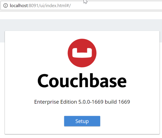
The installation and setup process has not changed much, but it does get a fresh coat of paint. The installer itself appears the same (although the setup wizard is likely to be revised in future builds). Once the installer is complete, you’ll get redirected to a browser (if you’re installing Couchbase Server locally, this means a browser pointed to http://localhost:8091 will appear). Functionally, this part of the experience is the same as before, but it gets a new coat of paint.

Figure 1. The setup screen forsCouchbase Server 5.0
After you click the "Setup" button, you’ll be taken through the installation wizard. Depending on which version you have been using, there may be some new options here that you haven’t seen. I’m not going to cover them in this post, but stay tuned for more blog posts about upcoming features in the latest releases.
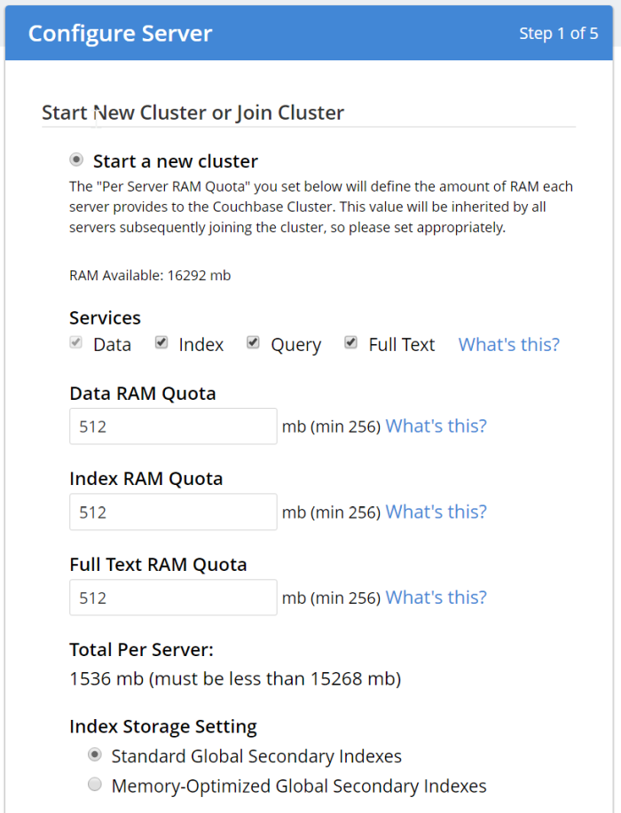
Figure 2. Starting a new cluster in Couchbase Server setup
The sample buckets are still available. Note that these buckets (as always) are not password protected, and are meant for development only. Please check out the recent Advisory Note about Couchbase security.
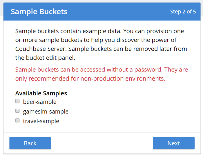
Figure 3. Loading a sample bucket (optional) during Couchbase Server setup
You can also choose to create a bucket named "default" during setup. Again, this is not recommended for production (even if you put a password on it), since it’s a well-known bucket name that makes it a target. It’s also optional, you can click "Skip".
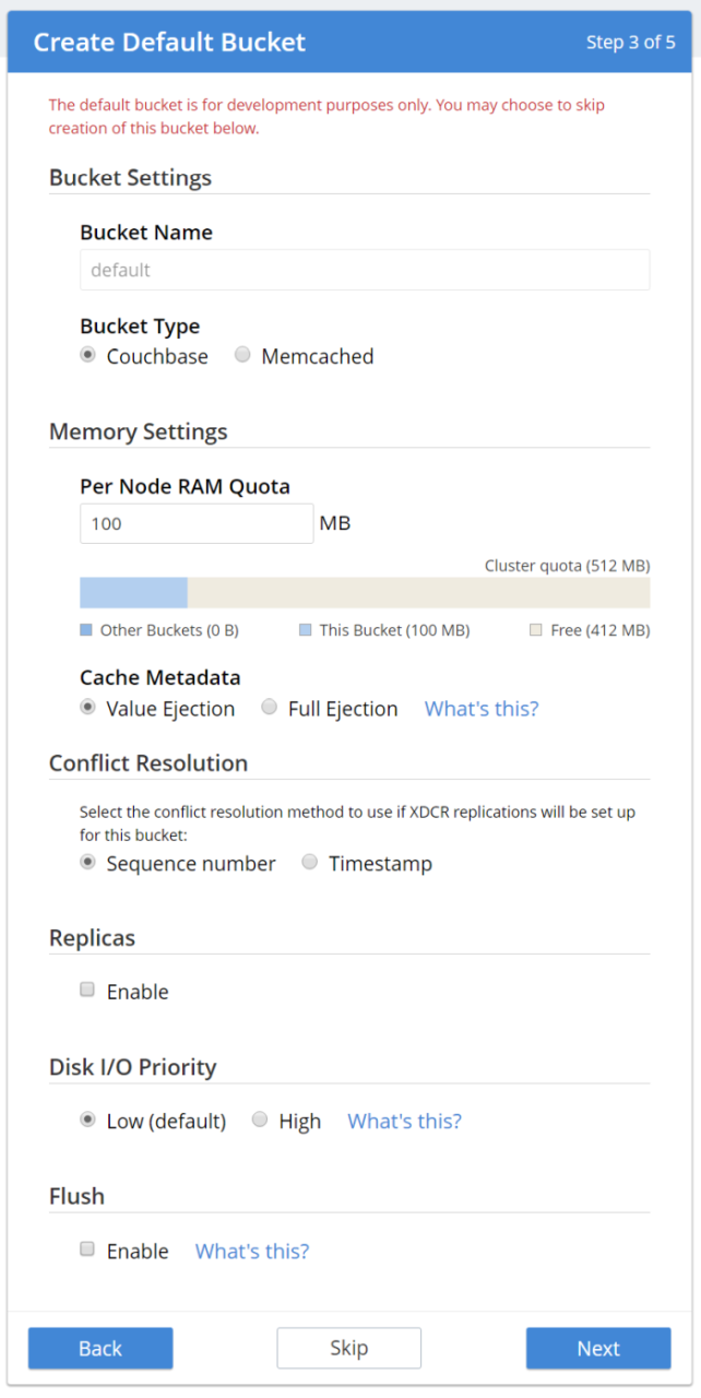
Figure 4. Create a default bucket (optional) during Couchbase Server setup
Notification and Terms and Conditions are next. We are offering the full Enterprise edition in the developer build, so you can check out the Enterprise features.
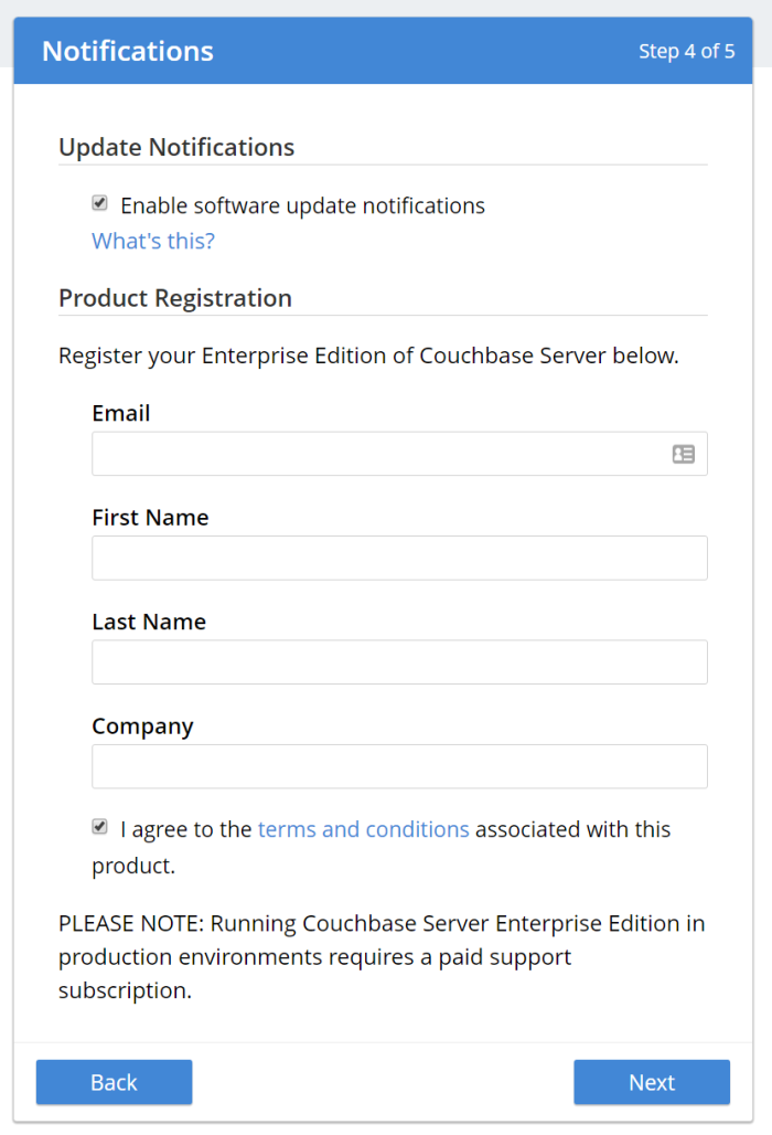
Figure 5. Accept terms and conditions of the Enterprise Edition and sign up for notifications
Finally, create an admin user. Once again, I recommend not using "Administrator" as the user name in production, as it is a well-known default. Also, make sure to use a strong password.
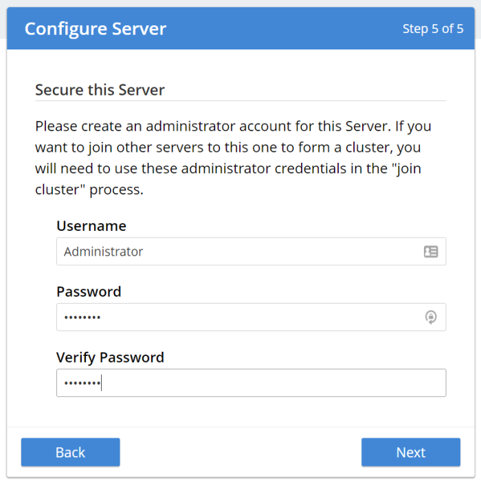
Figure 6. Create an administrator user for Couchbase Server
Using the new Couchbase Web Console
Once you’ve gone through the familiar install process, it’s time to see some of the substantive changes to the UI.
The first thing you’ll see is the dashboard screen, which has been streamlined.
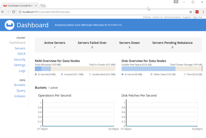
Figure 7. The new look of the Couchbase Server Web Console
Some things that jump out at me immediately:
The design. The new Couchbase Server UI is heavily influenced by Google’s Material Design. You will see more evidence of this as you navigate around the site. Material Design is meant to provide a "design language" that is geared toward "digital material" that can expand/change intelligently.
Main Navigation. The navigation is now vertical and on the left side of the page. Also notice that is is organized by "cluster" and "data".

Figure 8. Main navigation is now vertical
Servers
Click on the "Servers" link to see the new look of the servers page.
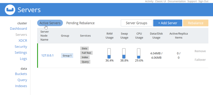
Figure 9. The Servers page shows a list of nodes
This should look relatively familiar. Each node is listed here, with a list of services running on each node and system metrics. I only have one node in my example, but each node would be listed here in a production deployment. Notice that there are filters "Active Server" and "Pending Rebalance" that have a rounded highlight. Next to them are some buttons to manage servers and server groups which use rectangle shapes. These shapes help to provide visual cues no matter what the size of your screen is.
Security
Continuing the tour, click on the "Security" navigation link.
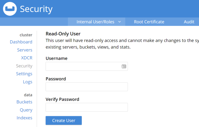
Figure 10. Couchbase Server Security UI
Not much different on this screen compared to the old UI, but I do want to draw your attention to the sub-navagation at the top: "Internal User/Roles", "Root Certificate", and "Audit". The secondary navigation across the site will be across the top of the page like this.
There are some new features coming soon for role-based security. I would expect the UI here to evolve in future versions to accomodate.
Query Workbench
As a developer, this is always my favorite part of the Couchbase Console, and the one I spend most of my time in. Besides the obvious design change, there are some minor improvements and changes here that I’d like to call attention to.
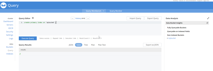
Figure 11. New design of the Query Workbench
No more Clear button. I use the clear button a lot, but my usage is probably atypical from a typical Couchbase user. The clear button is a frustrating button to hit accidentally while working on queries, so it’s been removed.
History. Click on "history" to see a list of all the queries that you’ve run. It’s searchable! Which can be very useful after a long day of query writing and data modeling. Remember that "clear" button? It’s here in the history popup; you can still access it, but you’re less likely to click it by accident.
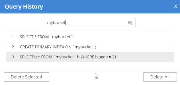
Figure 12. Query Workbench history with search
Data Bucket Insights. These have been moved to the right side of the screen. Personally, I think this is a better use of space. (This is an Enterprise Edition feature).
Plan and Plan Text options in results. By default, the queries you run will be EXPLAINed, and you can view the output of that in the Plan and Plan Text results. To turn that feature off, click the settings icon next to "Query Editor".
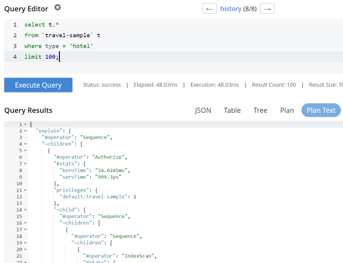
Figure 13. Plan and Plan Text results tabs
Query Monitor. Notice the "Query Monitor" secondary navigation link at the top. This page shows you information about some of the system catalogs that were added in Couchbase Server 4.5.
Buckets
As a developer, I spend a lot of time in the Buckets section of the UI. The new version of this page isn’t wildly different, but I have found it a little snappier.
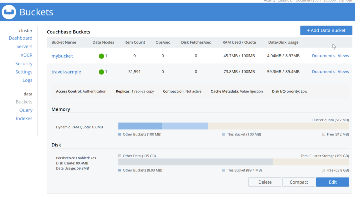
Figure 14. New Bucket management UI
Click on a row to expand information about the bucket (as well as to expose the Delete/Compact/Edit buttons).
Statistics and Charts
One significant area of change is the way that charts and statsitics are shown in the UI. Clicking a bucket name will still bring you to the analytics and information that you’re used to.
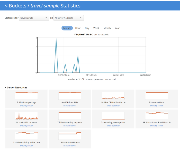
Figure 15. Chart that shows the number of N1QL requests
There aren’t any new charts that I’m aware of, but there have been changes made to improve usabilty of the charts as well as get them to adhere closer to the Material Design philosophy. They also take up the full space of the page, to maximize your view.
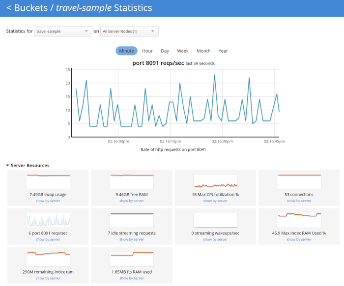
Figure 16. Chart that shows the number of HTTP requests
It’s difficult to demonstrate these changes in a blog post with static images (I may make a video walkthrough in the future), so I definitely recommend that you install the latest version of Couchbase Server 5.x and give them a try.
Why did you move my cheese!
Hopefully, these UI changes delight you and make your job easier. However, abrupt change can be difficult. This is why there is still an option to view the "Classic UI". Just click this link (at the top right of the page) and you’ll be albe to view the old UI. I don’t know how long the old UI is going to stick around.

Figure 17. Use this link to show the old "Classic UI"
To switch back to the new UI from the old UI, just click "New UI".

Figure 18. Use this link to go back to the "New UI"
It’s likely that new features will only appear in the new UI.
Feedback and Summary
Stay tuned to the Couchbase Blog for information about what’s coming in the new UI in the next developer build.
I’ve given you the basic tour, but to really get a feel for the UI, I recommend you download and try it. Download Couchbase Server 5.0 today!
We want feedback! Developer releases are coming every month, so you have a chance to make a difference in what we are building.
Bugs: If you find a bug (something that is broken or doesn’t work how you’d expect), please file an issue in our JIRA system at issues.couchbase.com. Or, contact me with a description of the issue. I would be happy to help you or submit the bug for you (my Couchbase handlers give me a candy bar and pat me on the head every time I submit a good bug).
Feedback: Let me know what you think. Something you don’t like? Something you really like? Something missing?
In some cases, it may be tricky to decide if your feedback is a bug or a suggestion. Use your best judgement, or again, feel free to contact me for help. I want to hear from you. No suggestion is too small! The only stupid question is the one you don’t ask! The best way to contact me is either Twitter @mgroves or email me matthew.groves@couchbase.com.
Kevin Griffin is using Twilio to control the phones.
Show notes:
- Twilio
- Twilio Blueprint (available for pre-order)
- DevConnections 2016 in Las Vegas
- KevGriffin.com (blog)
- HR (Hampton Roads) DevFest in Virginia
Want to be on the next episode? You can! All you need is the willingness to talk about something technical.
Theme music is "Crosscutting Concerns" by The Dirty Truckers, check out their music on Amazon or iTunes.
Welcome to another "Weekly Concerns". This is a post-a-week series of interesting links, relevant to programming and programmers. You can check out previous Weekly Concerns posts in the archive.
- Need a real API for demonstrating Ajax stuff? Check out The Example API. It provides all kinds of methods (GET, POST, etc), content responses (JSON, JSONP, XML, etc), response codes (404, 500, etc). Great for cross-domain testing, and it's what I used for my jsonp example post.
- Something to think about: Why Link Shorteners Harm Your Readers
- How to create better cards (in Pivotal, LeanKit, whatever card tracking/PM system you're using). I find the idea of gherkin/cucumber tests in the card to be an intriguing one.
- Need a dummy placeholder image? Use dummyimage.com to get them dynamically.
Ever experience the new wave? Next wave? Dream wave? Flava flav? A guy named Dave? Men's aftershave? A voodoo conclave? 12 Years a Slave? Shortwave? OR CYBERPUNK!? Ever stared at a CRT wistfully?
I didn't think so.
If you have an interesting link that you'd like to see in Weekly Concerns, leave a comment or contact me.
It's the last part of the series, and I just thought I would wrap things up by talking about unit testing the aspect. I wrote a whole chapter in my book AOP in .NET on unit-testing of aspects. I also was honored to do a live webinar with Gael Fraiteur on unit testing with PostSharp, in which he has a different view on aspect unit testing, so I recommend you check that out too.
I'm not straying too much from the book in this example, so if you're familiar with that chapter, there's not much new for you here.
My plan is to not test the PostSharp aspect directly, but instead have the aspect delegate just about all the functionality to a plain old C# class that's easier to test. The old adage of solving a problem by adding another layer of indirection applies. Doing it this way makes my aspect easier to test, further decouples my application from a specific framework, but does require some more work, so it's not like it's a magic cost-free approach to testing either.
Here is the aspect, all tightly coupled to PostSharp:
And here is my refactored code, which you'll notice results in a higher number of classes, but it is ready to unit test. You may also notice that some of the logic is a bit different than the above aspect. This is because I found some issues and bugs while I was writing unit tests. So, hooray for unit tests! Also notice the "On" static field. I touch on this in the book, but this flag is merely there so that I can unit test the actual services while isolating them from the aspect. Since PostSharp uses a compile-time weaver, this is necessary. If you are using a runtime AOP weaver like Castle DynamicProxy, that's not necessary.
I'll even show you some of my unit tests, which I've written in mspec and JustMock Lite with the help of Sticking Place for testing the SqlException stuff.
Notice that I moved the Exceptionless-specific code behind an interface (IExceptionLogger) as well, to further decouple, improve testability, and also because Exceptionless is just the sort of thing that might actually be swapped out somewhere down the line. I've left out the details of that implementation because it's quite trivial.
So now you are caught up to today: this is the aspect I'm actually using and deploying to a staging site for my cofounder and our designer to use and test. And so far I must say that it's working quite well, but things could always change when it actually hits real customers, of course.
Welcome to another "Weekly Concerns". This is a post-a-week series of interesting links, relevant to programming and programmers. You can check out previous Weekly Concerns posts in the archive.
This is a special edition of Weekly Concerns, in that I'm attempting to cover the recent dust up over TDD that was triggered by DHH and responded to by several notable developer pundits. Note that I respect all of the developers in this conversation and I believe they are all making important points, but the way they communicate can be somewhat... abrasive... so make sure your jimmies are secure before you start reading.
- April 22: David Heinemeir Hansson's opening keynote at railsconf which lays the groundwork for...
- April 23: TDD is dead. Long live testing. by David Heinemeir Hansson.
- April 25: Monogamous TDD by Uncle Bob Martin.
- April 29: RIP TDD by Kent Beck
- April 29: Test-induced design damage by David Heinemeir Hansson.
- April 30: TDD, Straw Men, and Rhetoric by Gary Bernhardt. First DAS blog post in years.
- April 30: When TDD doesn't work by Uncle Bob Martin.
- April 30: Slow database test fallacy by David Heinemeir Hansson.
- May 1: Test Induced Design Damage? by Uncle Bob Martin.
- May 1: The TDD Divide: Everyone is Right by Cory House.
- May 2: Professionalism and TDD by Uncle Bob Martin.
- May 3: A remix of Professionalism and TDD by Gregory Brown.
- May 9: Is TDD dead? Part 1 panel discussion on Google Hangouts with David Heinemeir Hansson, Kent Beck, and Martin Fowler.
Lots of others have weighed in, of course, in blog posts and on Twitter. This type of discussion has been going on since Kent Beck wrote his TDD book; I believe it will continue long into the future. So I guess it's probably a good time to reread Jim Holmes book "Best Practices in Software Engineering and Testing", which is no longer available, but I will reprint in its entirety here (completely from memory, so forgive me if the phrasing isn't quite right):
"Use your brain."
If you have an interesting link that you'd like to see in Weekly Concerns, leave a comment or contact me.


