Posts tagged with 'accessibility'
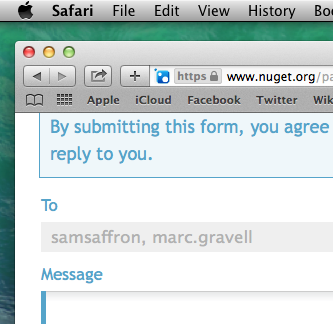
I took a look at an issue submitted to an OSS project relating to contrast. The submitter of the issue claims that the text is hard to read on the Safari web browser. I looked at it in Chrome as well as Safari, and it looked roughly the same. Here it is:

Does that look hard to read? To me, I can definitely read it, no problem. But that's a rather selfish point of view: not everyone has the same ability to see as I do. We often hear about making web sites more accesible for users with screen readers (for the blind), but this is a case where it might be fine for someone with very healthy vision, and it might be fine for someone with no vision, but it might not be okay for someone with low vision.
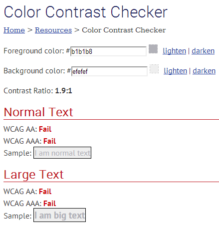
So, I could just ask my Twitter followers what they think, but it would nice if I had a more concrete, objective way of knowing if this issue needs fixed or not. The W3C contrast ratio guidelines (pointed out to me by Jon Plante) gives me that concrete guideline to follow: a contrast ratio of at least 4.5:1. WebAIM's Color Contrast Checker makes it easy for me to do the math.
I opened up the above screenshot in an image editor1, and used it to figure out what the background and foreground colors are (MS Paint can do this, though you'll have to do the decimal-to-hex conversion yourself). The background color is #EFEFEF and the (main) foreground color is #B1B1B8. Here are the results:

So, yes, this issue definitely has merit, so I submitted a pull request to NuGetGallery.
1In many cases, you can simply look at the CSS, but since this markup was in a disabled textbox, the browser actually dims the color. Hence the reason I needed to use an image editor.
